Foodtruck Riders
Veneer
Design
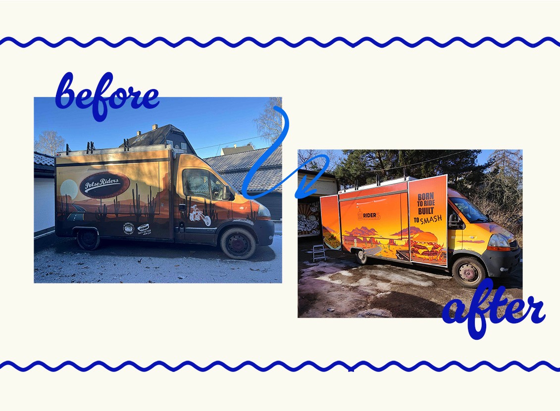
How we transformed a tired food truck into a mobile advertisement impossible to ignore. The old wrapping made the food truck look like just another random van in the parking lot. We rebuilt it into a fully-fledged brand experience on wheels. The result? Stronger brand recognition, a cohesive image, and a truck that grabs attention even before customers smell the burgers.

Problem
The previous Pulse Riders identity was dark, visually heavy, and completely lost in the surrounding events or street traffic. The branding didn't convey the brand's energy or the quality of the product. The problem wasn't just the "old look." It was that the truck didn't evoke emotion or leave a lasting impression. In mobile catering, the customer's first contact isn't taste. It's visual. And if your food truck doesn't capture the eye within the first few seconds, you're losing before the customer even reads the menu.
OUR INSIGHT
Most food trucks communicate the same message: dark colors, random graphics, and a jumble of information. We understood that a truck shouldn't look like a vehicle; it should act as a billboard for emotions. Customers don't consciously analyze branding. Their brains make decisions instantly: "This looks good = this probably tastes good." Therefore, the branding had to create an immediate wow factor, even before they order.
BRAND / BUSINESS TRANSFORMATION
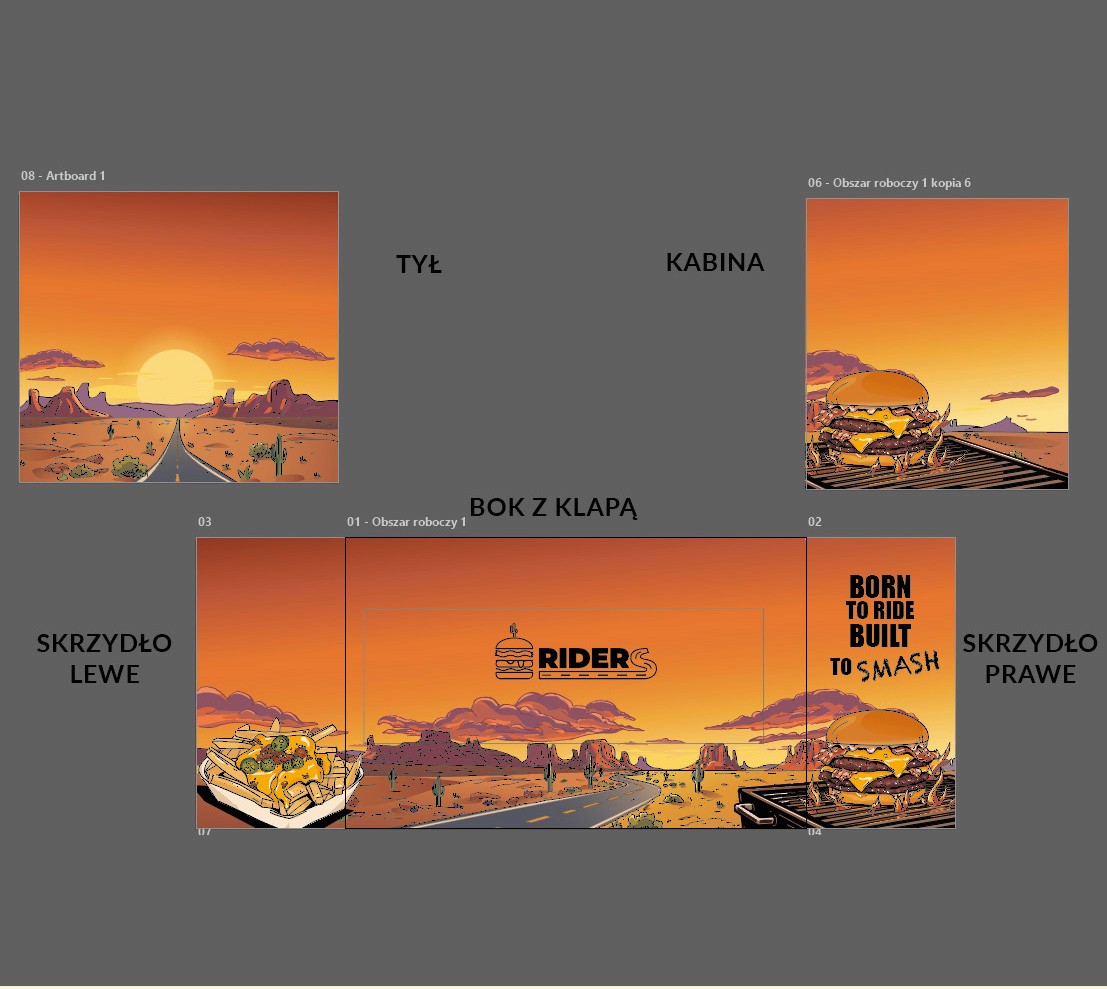
We didn't just refresh the old wrap. We designed a new brand identity from scratch:
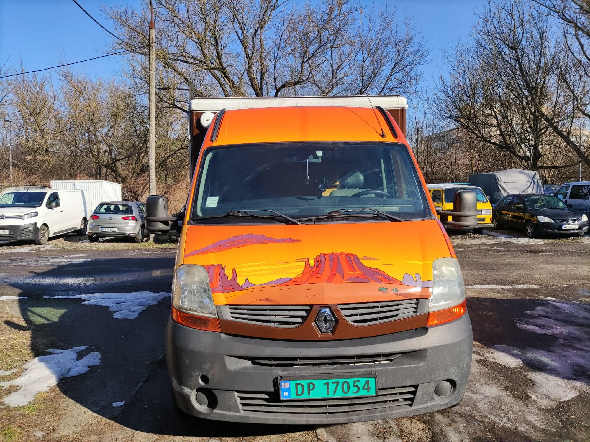
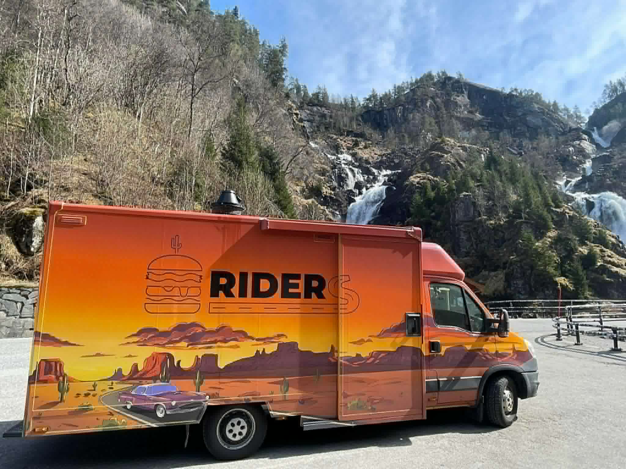
Hand-illustrated brand world: Every graphic element was hand-drawn to create a unique atmosphere inspired by American road trips and rider culture.
New visual identity: We built a consistent color, typography, and communication system that distinguishes the brand even in a crowded event space.
Wrap as an experience: Intense colors and dynamic illustrations make the truck look more like an attraction than a food court.
A menu designed for sales: In addition to the wrap, we also created a new menu that is clear, easy to read, and guides customers to make decisions without overloading them with information.
EXPERIENCE SYSTEM
The entire project was designed to function in traffic and in real-world street environments:
Visibility from a distance: Contrasting colors and large graphic forms make the truck stand out from the surroundings, even during large events.
Consistent touchpoints: The wrap and menu communicate the same brand energy, ensuring a complete customer experience from first glance to ordering.
Branding that does the marketing itself: The truck has become a natural focal point for photos, stories, and people's attention in urban spaces.
The new identity has transformed Pulse Riders from looking like "just another food truck." The brand has gained a stronger character, greater visibility, and a cohesive image that builds associations even before the customer tries the product.
🧠 LEARNINGS
A food truck doesn't just compete on food. It competes on attention.
Branding in mobile food service must work in 3 seconds - that's how long you have before the customer looks elsewhere.
A good wrap isn't just decoration. It's a sales tool on a grand scale.

